About Project
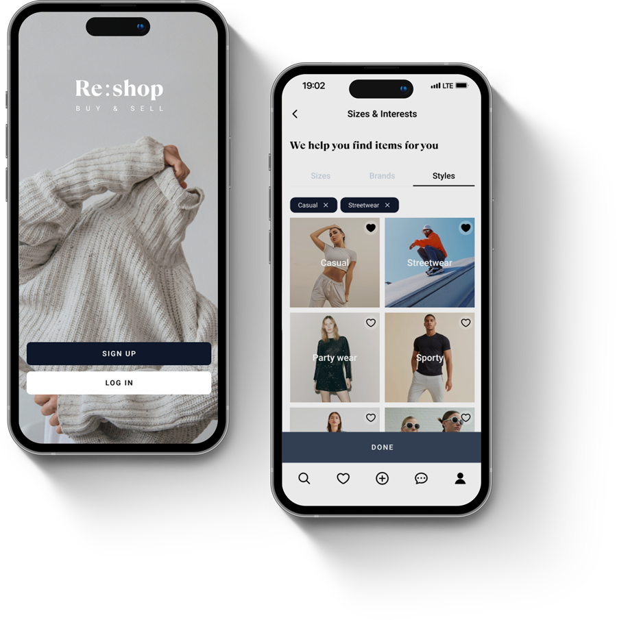
Basically, it’s a second-hand clothing platform that users can buy and sell. For the personal project, this is a concept of an iOS app I created with UX Research included in the process.
Timeline
September – December 2022 (12 weeks)
TOOLS

Discover
It’s time to make fashion good for people and the planet
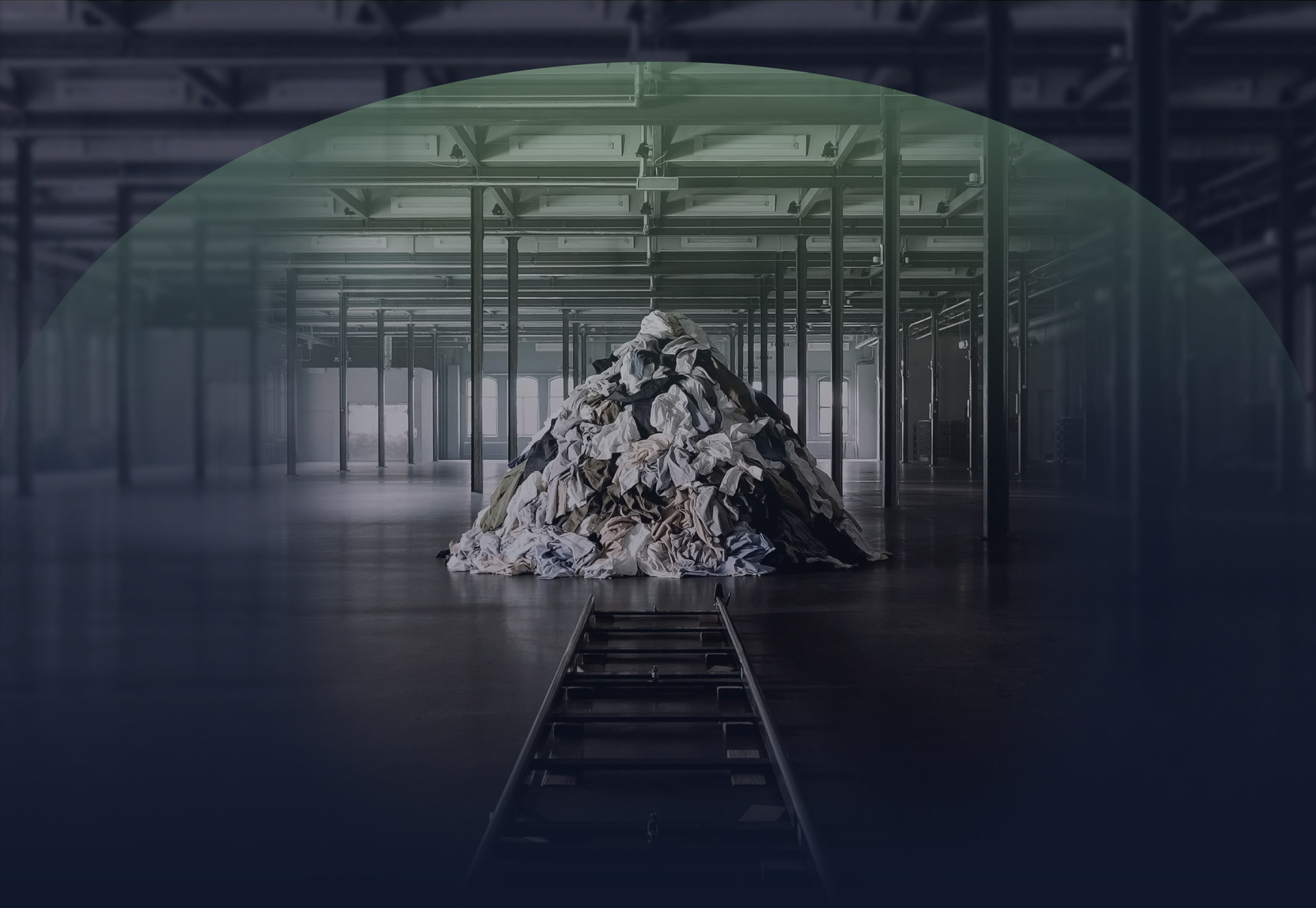
The fashion industry is one of the largest water consumers in the world right now. Not only water but also energy, materials, and land are all resources needed to produce new clothes.
100 billion garments are produced each year
About 2,720 liters of water are used to make one cotton shirt
7 times on average a garment is worn before being thrown away
At least 50% of the clothes in our wardrobe are not worn
My goal
Sustainable fashion
Plan
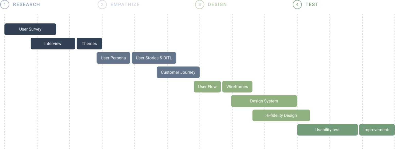
Research
User Interview
To identify the target user characteristics of Re:shop and further set the overall direction of the project, I conducted in-depth interviews with users who have previous experience with thrift apps.
Interviewed: 10
Age: 20 - 60
Q. What do you think about buying and selling second-hand clothing on the app?


Research
User Survey
Interviewed: 15
Age: 20 - 60
Q. What is your primary motivation for buying second-hand clothing?
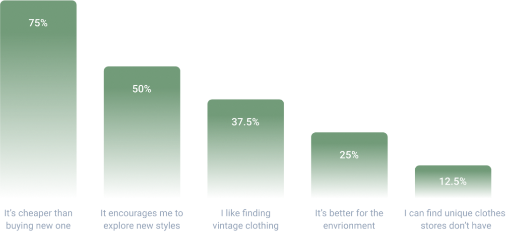
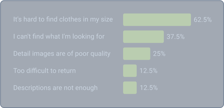
Q. What’s the most frustrating thing about shopping for secondhand clothes?
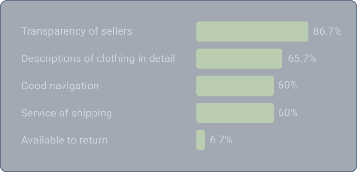
Q. What are the features you are expecting?
Q. Have you thought about waste problem of the fashion industry?
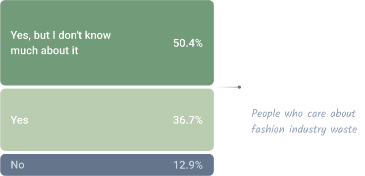
Q. Would you consider sustainable fashion to protect the environment?
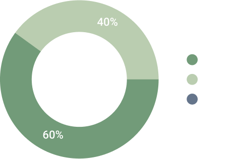
Trends and themes
After conducting interviews and giving out surveys,
I collected and analyzed data and looked for trends and themes

EMPATHIZE
EMPATHIZE
User Persona
I chose Jay as a primary persona because I wanted to design an app that targets those who are interested in Sustainable Fashion but are not sure where to get involved.
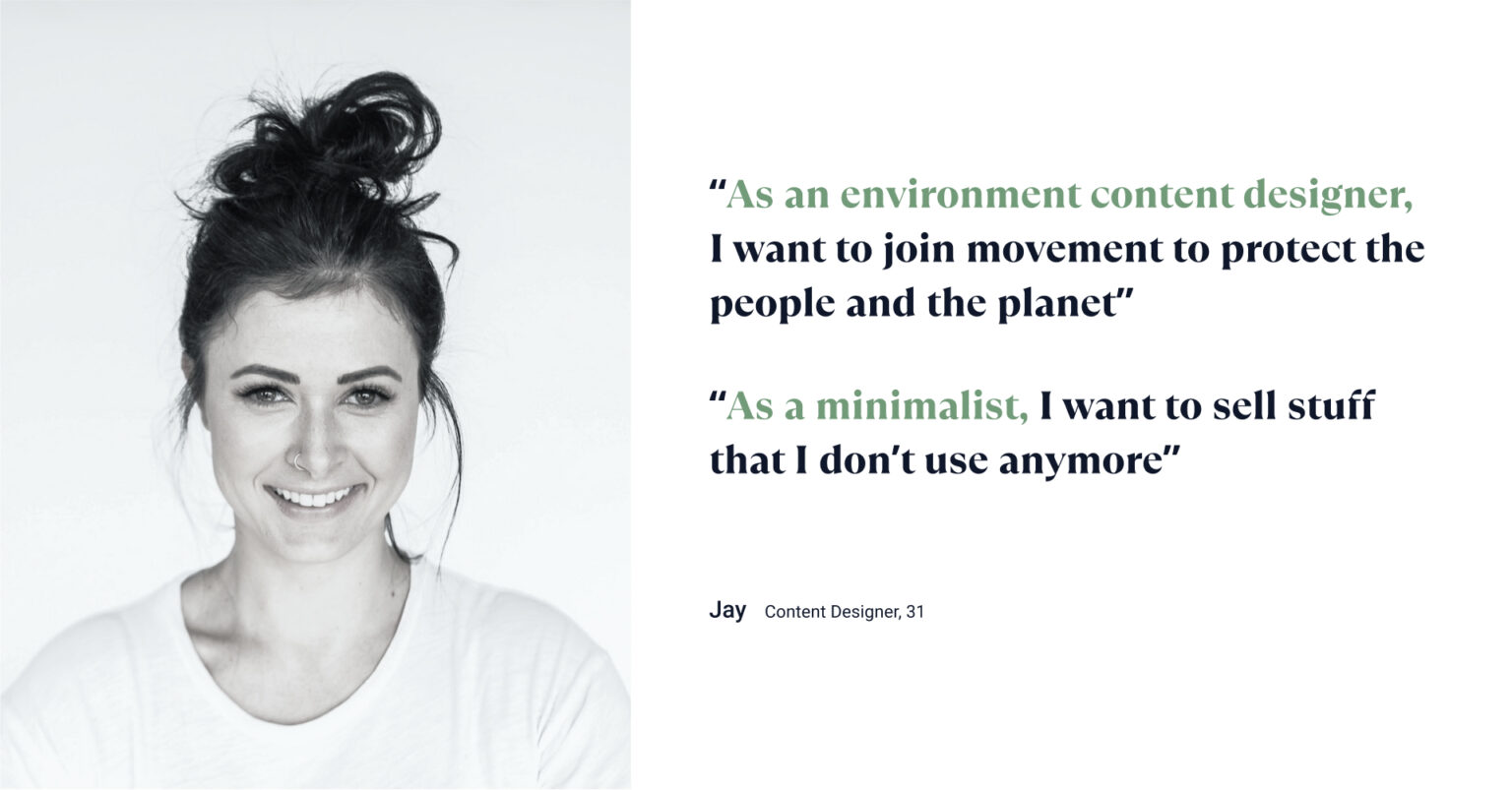
About Jay
Pain points
- Problems with scams and finding clothes that fit
- Lack of information about Sustainable Fashion
Goals
- Shopping that is eco-friendly
- Making her shopping experience more efficient
EMPATHIZE
Solution
Through user stories and customer journeys, I found pain points and solutions for every four steps; awareness, search, buying, selling

DESIGN
Design
User Flow
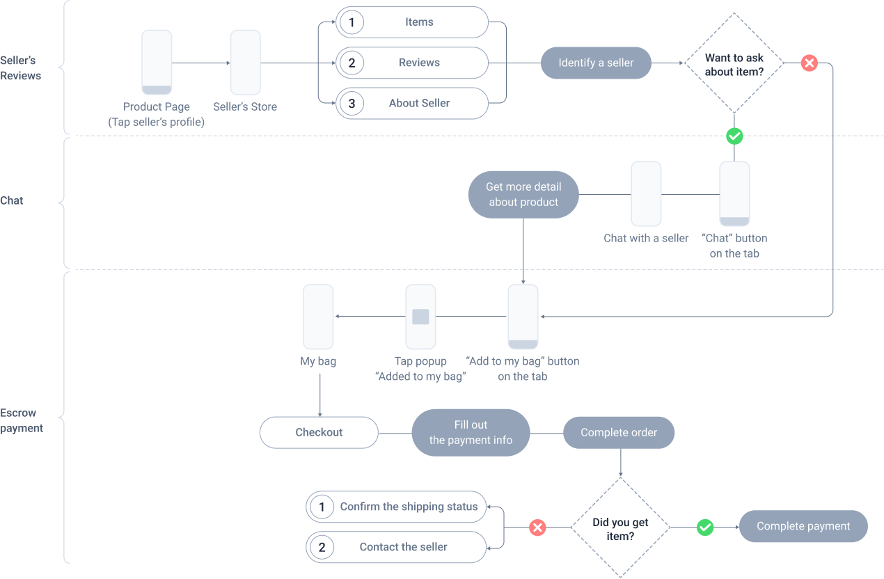
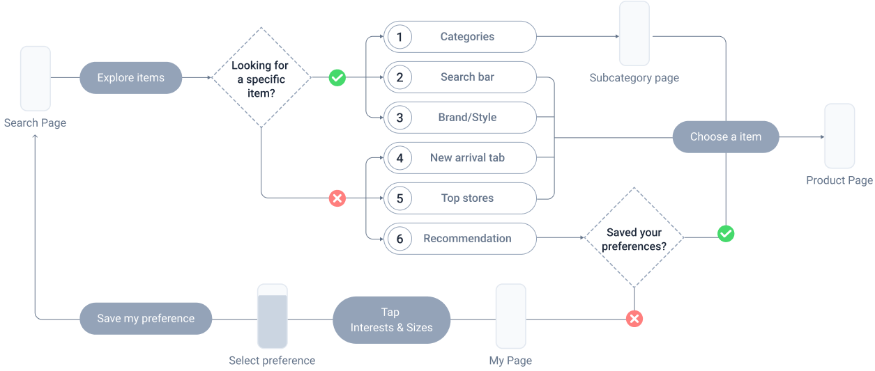
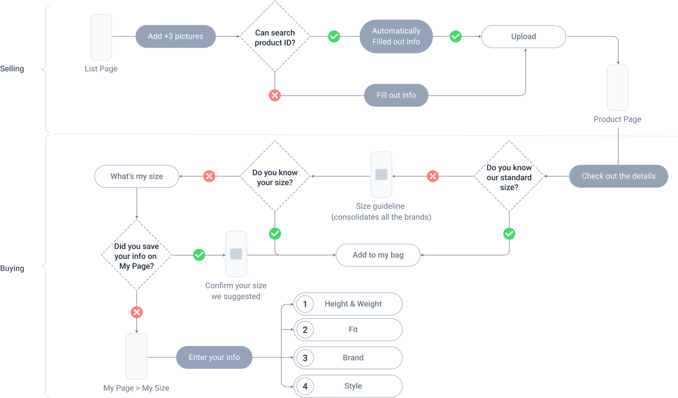
In order to design a user-centric experience, I created user flows for each process (establishing credibility, searching, buying, and selling) and wireframed them
Action 1 | establishing Credibility
Action 2 | Searching
Action 3 | buying & Selling

Design
Design System
Logo Design
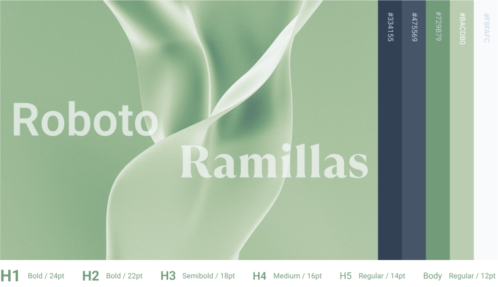
The name Re:shop refers to re-selling and re-buying. I designed a logo to appeal emotionally and chose color schemes with green neutrals that implicated nature.

ICONS
Key contour lines
All icons in the 1024×1024 resolution (16×16 64 times).
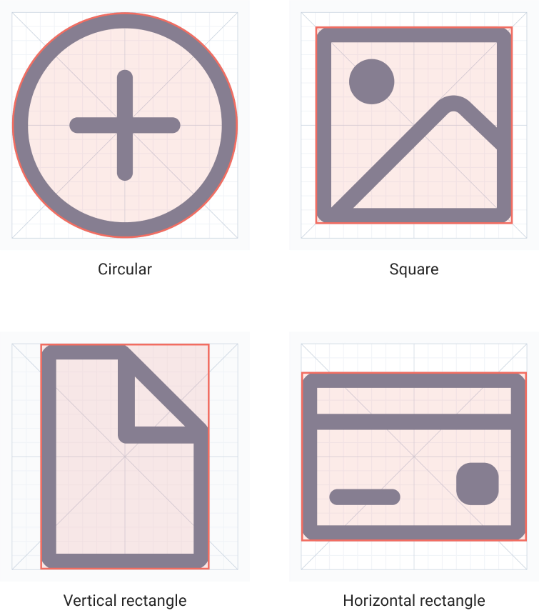
Outlined icons

Solid icons

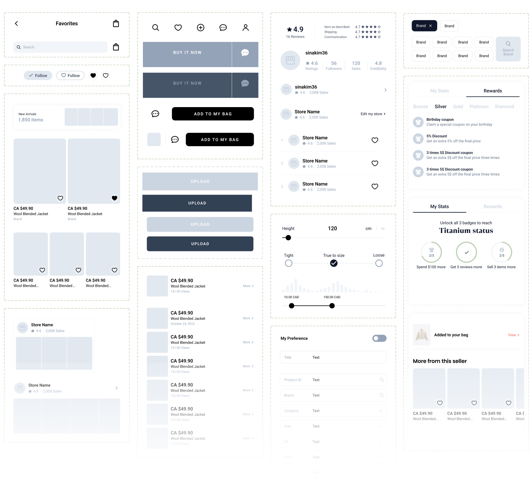
COMPONENTS
COLORS, TYPEFACES
IOS MOBILE GUIDELINES
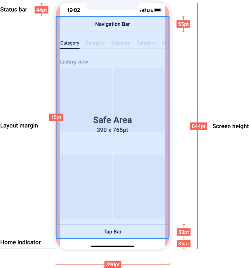
IOS MOBILE GUIDELINES

Design
Hi fidelity
awareness
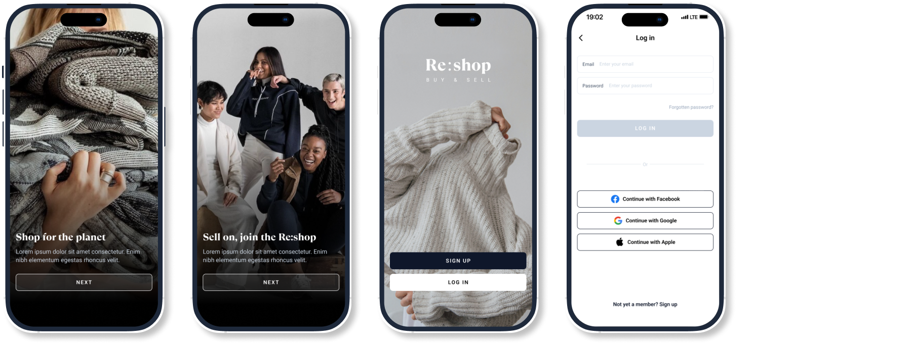
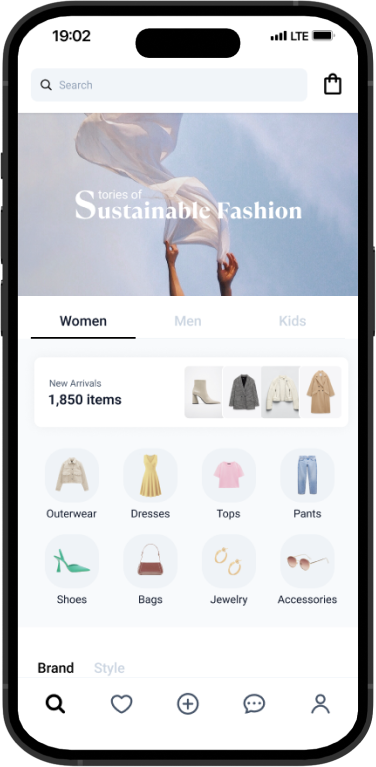
Promoting sustainable fashion, encouraging participation
It is essential to promote sustainable fashion in order to raise awareness. In addition, Re:shop encourages participation through our reward system.
Searching
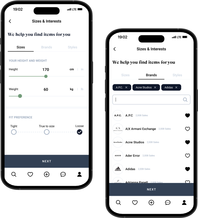
Categories, recommendations
based on your preference
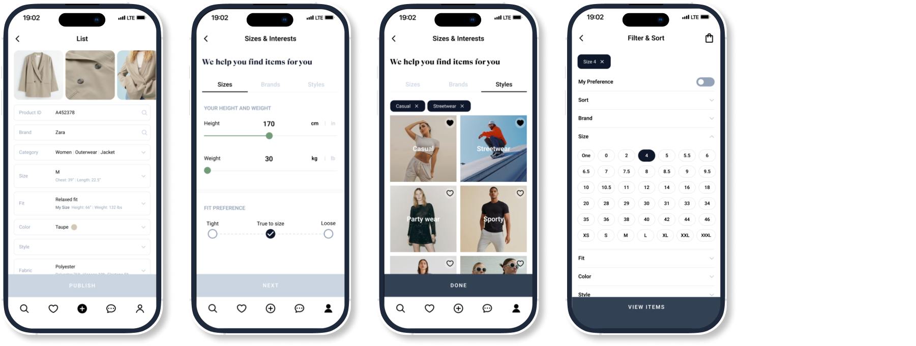
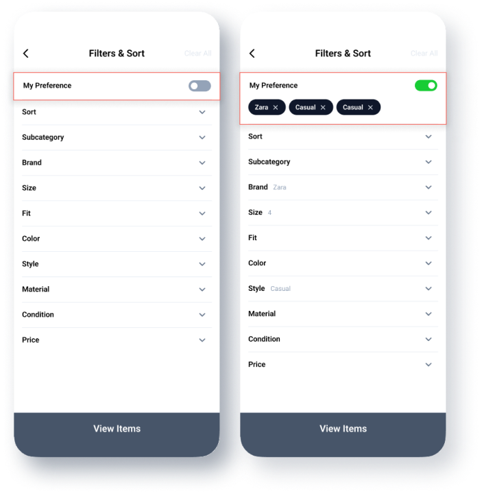
Let’s find what you’re looking for. Re:shop recommends items based on your sizes, interests, and styles.
Buying
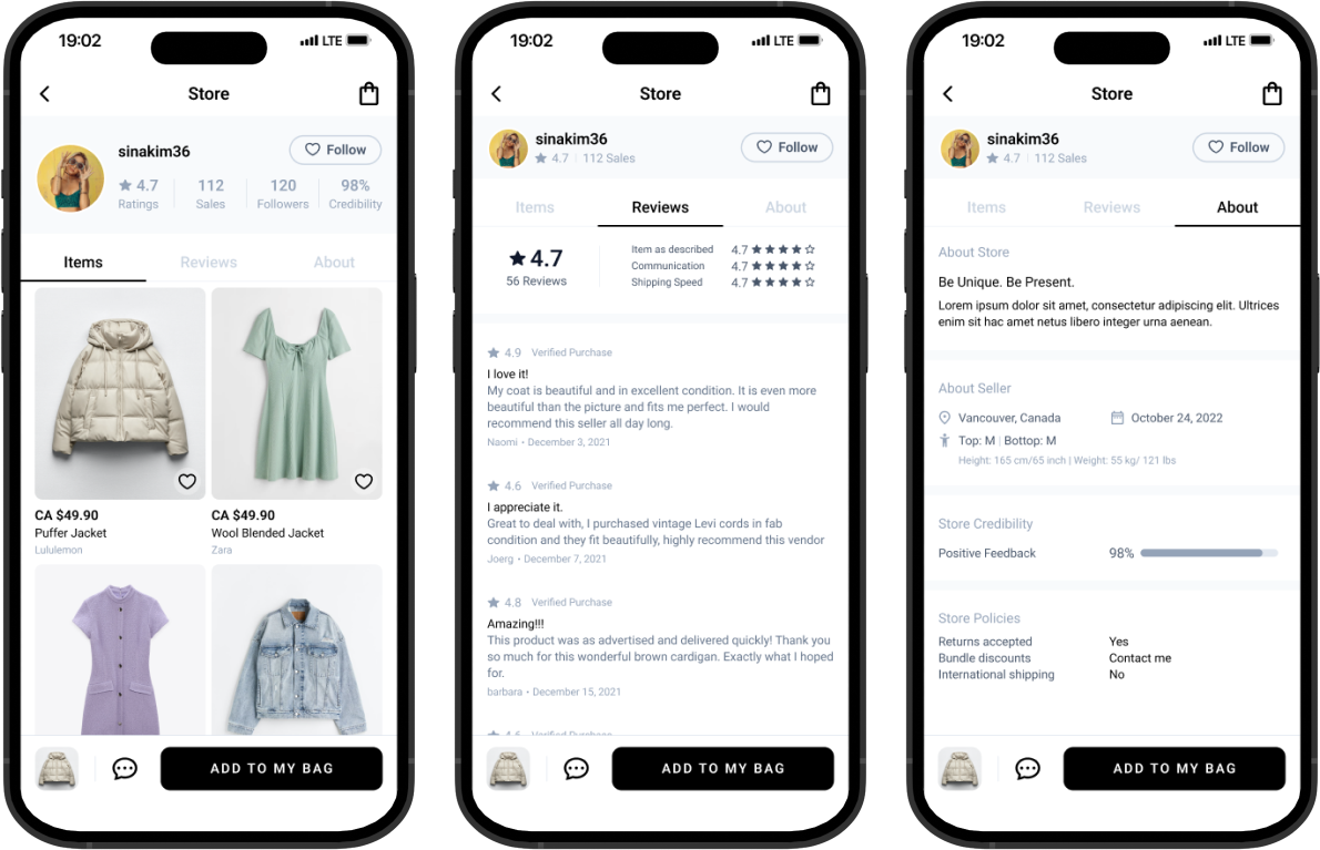
Reliable sellers,
escrow payment system
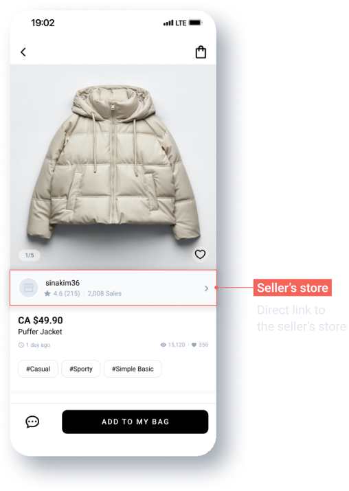
There’s no need to worry about scammers. You can make a safe purchase based on the ratings and reviews of the seller’s store.
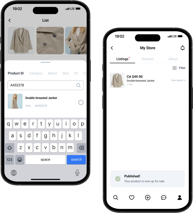
SELLING
A well organized
and fast posting process
You can save time when you post. The form will be automatically filled out if you know the product number of the item.
User Test
User Test
Usability Test
To start performing user tests with actual users, I created interactive wireframes in Figma and a description of the action that I wish users to perform. For each iteration, I documented the results that I obtained and made changes based on the feedback.
Before
Filter & Sort | Feedback

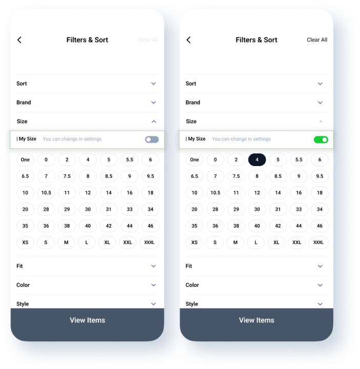
After
Filter & Sort | Improvement

Product Detail | FEEDBACK

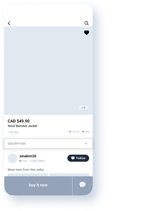
Product Detail | Improvement

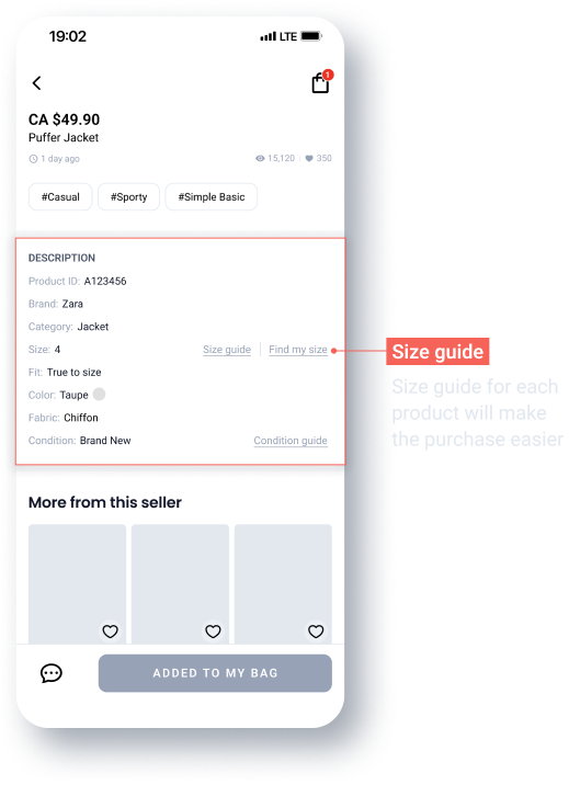
Seller’ Store | FEEDBACK

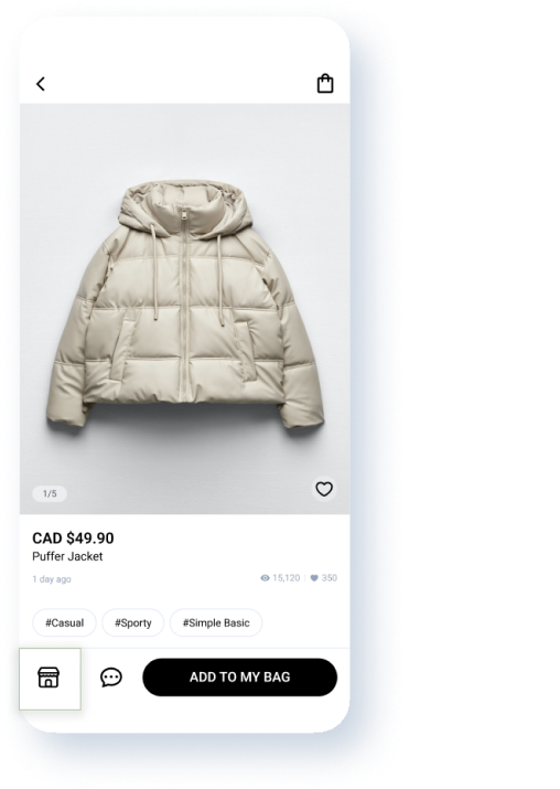
Seller’ Store | IMPROVEMENT

